Search Within This Blog

Showing posts with label Fan Art. Show all posts

Apr 16, 2016

A New Talon

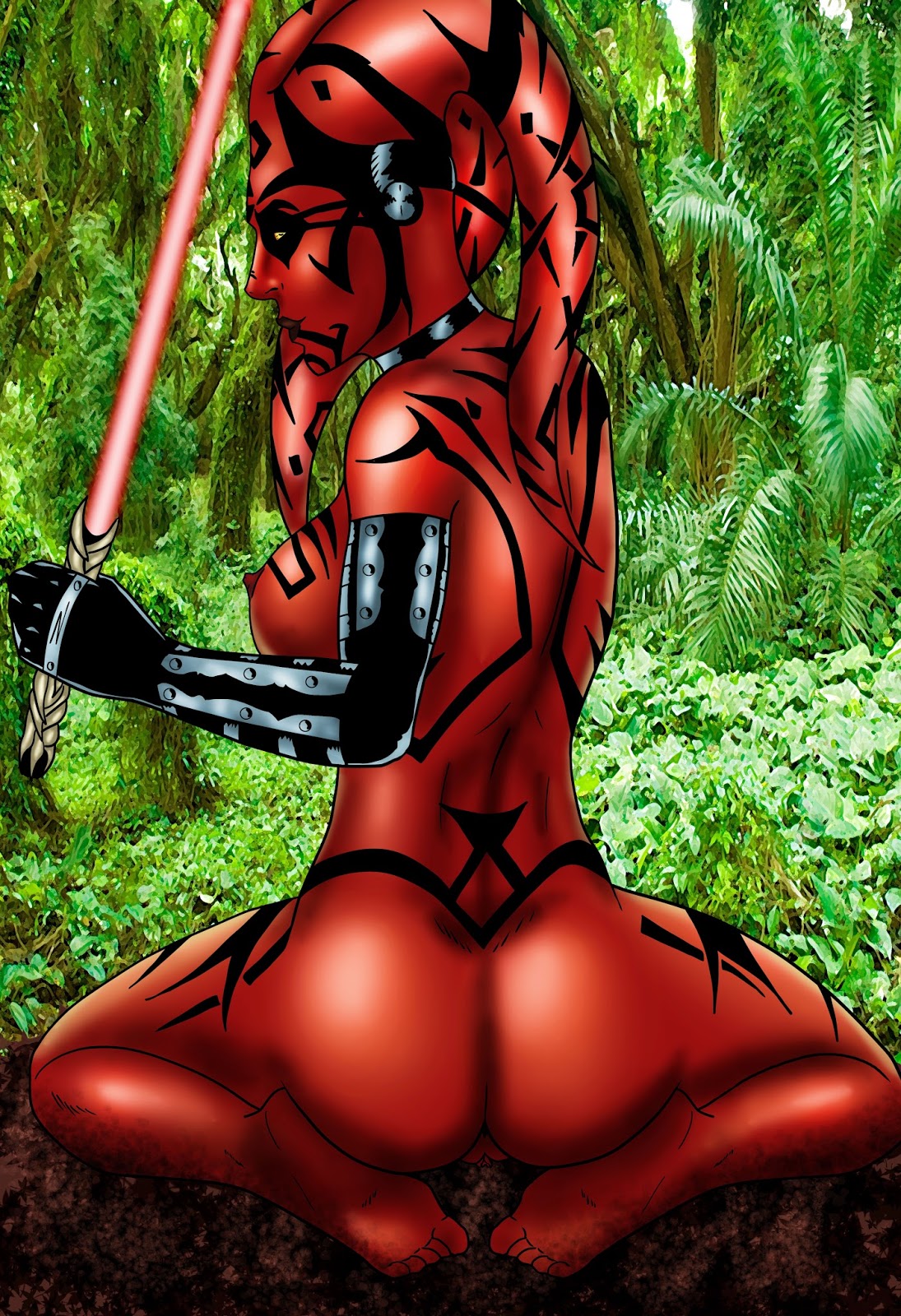
Darth Talon has been quite popular ever since her debut in the Star Wars: Legacy comic book series a number of years ago.  I've drawn her only 3 times over the years with this marking number 3.  Her tattoos are always a chore to do, but they ultimately help sell the final image. 


Nov 13, 2015

The Quiet in Nature

Metal Gear Solid V has been receiving much critical acclaim and praise for being what is believed to be the conclusion to the Metal Gear Solid series of games.  Metal Gear Solid is well known for its stealth gameplay mechanics, complex storyline, cutscenes that can be a movie unto themselves, giant robots, and interesting character designs.  

One of those characters is Quiet, a sniper whose character design has been lighting the internet ablaze for some time now.  

I drew my own spin on Quiet and this was the end result.  I felt it came out pretty good.  

Aug 28, 2014

My Favorite Valentine

I've been playing a lot of Resident Evil lately.  Resident Evil 2 and Resident Evil 3 to be precise.  Ever since I first played Resident Evil 2 on the Nintendo 64, I was hooked on the series.  I had never played anything like it to that point in time.  I have many fond memories of running around the Raccoon Police Department and being hunted by Mr. X and of the numerous confrontations with constantly mutating William Birkin.  Resident Evil 2 was actually pretty short once you knew where to go and what to get.  It debuted a concept in the form of a relentless hunter that was much stronger than your regular enemies and able to pursue you at seemingly random times (though once you've played through the scenarios once, you'll know exactly when to expect Mr. X to show up).

The Mr. X concept was essentially ramped up and intensified to become Nemesis in Resident Evil 3.  Nemesis was much tougher, faster, and smarter than Mr. X in RE2.  Whereas Mr. X could only attack you at scripted points in the game, Nemesis could strike you almost anywhere in the game in addition to the regular scripted encounters.  There's only a few times in the game where you must fight Nemesis and don't have an option to escape.  The rest of the time you can choose to run rather than fight, but he will chase you until you take him down or you advance forward to certain parts of the game.  Though I still hold the Gamecube remake of the original Resident Evil to be the best game the series has ever produced to this point, Nemesis had its moments when it was pretty slick.  

The main protagonist of RE3 is Jill Valentine, one of the original characters from the first game.  Pretty much all of the Resident Evil ladies have developed their own fan bases in a way, but Jill still reigns supreme as the most popular of them second perhaps only to Claire Redfield of RE2.  Nevertheless, all the time spent playing RE3 lately inspired me to draw this pic on the right.  It's a simple concept of Jill posing in a very sexy manner with a silhouette of the Nemesis behind her serving as a semi-bodyguard as well as a convenient placer of tentacles.  For anyone wondering, the "X"s all over his silhouette are marks used to indicate sections that should be all black.  Sometimes artists will choose to shade those spots in pencil and sometimes they use the "X" mark to indicate to an inker what it should be colored in.

In an earlier post (this one as a matter of fact) I posted a sketch of Claire Redfield I was working on.  This was what the final colorized version ended up becoming.  Fans of the RE series will no doubt be able to recognize all the nods on the monitors behind her.

Jun 20, 2014

Standby For Titanfall

For those of you who haven't seen the finished image, this was the completed Sarah from Titanfall pic.  I was more or less pleased with how this finally came out.  For coloring this image, I used a picture reference for capturing the way light would be falling on the character.  Another fun thing I put in here that nobody to this point has noticed is the Call of Duty: Ghosts logo faintly crossed out in the background.  I own both games for Xbox One, but the number of hours I've spent on Titanfall has thus far outweighed the time spent on Ghosts.  I may do more of Sarah in the future, but at this point in time I'm spending most of my creative energies into getting an original project off the ground.


Mar 21, 2014

Titanfall!

Titanfall!  I've been playing Titanfall (available for PC and Xbox One) since launch and I love it!  I feel it's less fast-paced and more balanced than the Call of Duty series.  Oh, and the ability to run-n-gun in giant mechs is a huge plus.  

One of the characters from Titanfall is Sarah.  Sarah is a part of the Frontier Militia (there isn't a whole lot known about her simply because there isn't much of a story to Titanfall to begin with).  Nevertheless, I was taken by her model and decided to draw her in my own style.  I opted to go with something highly erotic, but not overtly so.  I thought it would be a nice contrast to the constant combat and shooting environment she appears in within Titanfall.


Jun 10, 2013

Behind the Scenes: Lulu

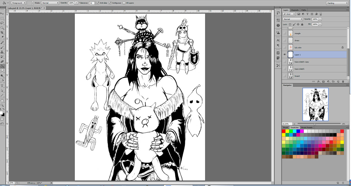
For this week's blog post, I decided I'm going to talk a bit about my process for colorizing my pictures.

The first step is of course the sketch itself.  There's no wrong or right way to do a sketch.  That's all up to the artist and how much additional prep work they may want to do before coloring.  I try to draw a fairly clean sketch so there's less clean up to do when I scan it.  Some artists might choose to draw in blue pencil and go over it with ink or a dark pencil.  Some prefer to do a rough sketch and trace over it in ink using a lightbox or even digitally in Photoshop or GIMP or other art software. 
Lulu sketch digitally modified

To the right is the scanned sketch.  Both for sake of visibility and general cleanliness, I always adjust the image's color levels before I upload it anywhere (it makes the blacks blacker and the lights lighter; useful for removing most leftover smudges and pencil marks).  If you draw on standard letter-size/printer paper, you'll be able to scan in your work with one pass.  However, if you draw on anything bigger than that (this sketch was done on 11"x14" paper), you'll have to scan your image in 2 or more halves and digitally stitch them together.  It's not as complex as it sounds.  Pretty seamless if you're only dealing with 2 pieces.  More than 2 and it gets just a bit more difficult, but still not too bad.  


The next step after scanning in the image is to separate the line art from the background.  This is so that the black lines will stay on top of everything (think of the line art as the icing on a cake).  Which software you're using determines how easily that can be done.  There's more than one method to separate line art.  Just a matter of which you prefer.

Now that my line art has been separated, I'm going to keep it as the first layer and set the layer type to Multiply.  From there I start creating different layers.  There's no rules for how many layers you can or should have, but more layers usually means a bigger file size and more CPU resources.  I combine elements on a layer where possible provided that they don't touch each other (you don't want your elements touching on the same layer as that can confuse you when coloring or making special adjustments).  For example, I have Lulu's hair on the same layer with her belts, and her dress's fur lining on the same layer with the floral designs on her sleeves.  I have all the dolls on their own layer, but I would not put the dolls on the same layer with her hair pins because those two elements are directly touching and would make coloring more difficult.


Lulu pic layers
My method for composing layers is flatting all the colors out first in their respective layers.  I do it either by using the lasso tool for precision or just painting broadly and erasing the overrun later.  When creating layers, always keep visibility in mind.  A layer higher up in the list will supersede everything beneath it and something low on the chain will not be able to be seen through the elements above it.  It all works very much like a cake, if you will.  

You can see I've started some of the actual coloring process.  There is no one good way to color.  As with everything I've mentioned, it's all about user preference.  Some kind of a graphics tablet with a pen is pretty much a must for doing any kind of coloring.  My tool of choice at this time is a Wacom Intuos5 Medium.  Coloring remains as a process that I am still far from being great in.  An artist's work is never done...


May 27, 2013

Black Magic Woman

Lulu sketch
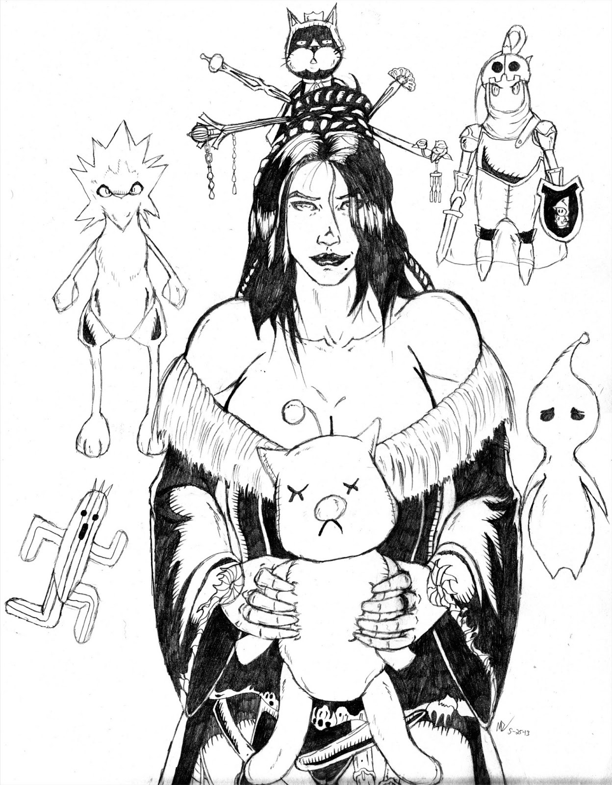
I started this sketch of Lulu about 2 weeks ago.  Finished it up yesterday.  The final version is pretty close to what I had originally envisioned when I started sketching it.

In Final Fantasy X, Lulu casts magic using voodoo dolls as her weapons (all of which are floating around her in the sketch).  I found some of the dolls tricky to draw as I was unable to find much good in the way of reference pics.  

I know Lulu wears a variety of necklaces, all of which were excised both for the sensuality of the image and because I wanted to move on from this sketch.

I've started working on my next sketch.  I'm not yet sure who the character will be as I'm still composing the body.  At this point in time, I'm thinking a lady from the Resident Evil universe.  I shall not harp on the topic at this time...


May 20, 2013

Practice Makes Perfect

Lulu WIP
I started working on a sketch for the The Warriors of Final Fantasy tribute over at Game Art HQ (the Deviant Art group page can be found here).  I opted first to take on Kuja, then Beatrix, and Freya before finally landing on Final Fantasy X's Lulu.   

The pic to the right is of course not finished, but it's what the final version is more or less going to be.  I encountered quite a bit of anatomical difficulty with constructing this image.  But I learned some things while studying how I could improve.

I think part of the key to creating good art is understanding how the muscles lock in together.  If you can keep the layout of the underlying musculature in mind, it can keep you on the right track when building your pose.

Whenever I compose any picture, I usually will draw the body completely naked first before adding any clothes.  So sometimes that means I spend a good chunk of time defining a form that is soon to be overwritten and erased.  Maybe there are faster ways, but I need to understand where the underlying form is before I can clothe it.  Of course, sometimes it's simpler to just leave it unclothed... 


Jul 23, 2012

FIGHT ON: Fulgore

"Fight On: Fulgore"
If you were a gamer in the 90s, you probably heard of Killer Instinct.  Killer Instinct was Rare's attempt at a fighting game and it was pretty good.  I never really got into fighting games too much and still don't today, but I did enjoy the character designs and the music.  Front and center on the game's Super Nintendo cover was none other than cyborg Fulgore.  The sketch on the right was done for a tribute gallery at Deviant Art devoted to Killer Instinct.  This sketch was intended as a semi-redesign of his look.  His design assumes he wears some sort of body suit with armor plating over the largest areas.  I used Predator masks as a point of reference when tweaking Fulgore's mask.  It's still pretty similar, but is significantly more angular and sharp.  The claws also were heavily inspired by the Predator blades.  I will be colorizing it later this week.

Jun 27, 2012

Frost In The Air Colorized

"Frost In The Air" final
Finally got around to adding colors to this one.  This one wasn't too bad to color.  I knew from the outset that the strength of this picture would be lie in how well I could render the ice.  I know the ice isn't technically realistic in how ice would respond in reality, but given that the ice is unnatural in the first place I didn't think it a big deal.  I aimed to do everything here in very cool colors.  I considered using color holds for Frost's skin, but ultimately decided to leave it as is. 

Jun 22, 2012

Purr Of The Catwoman

"Kitty Purrs" sketch
I didn't notice until recently that I haven't really drawn any DC Comics characters outside of Supergirl.  That changes with this sketch, titled Kitty Purrs.  This was done as gift art for a friend.  Nevertheless, this marks my first attempt at drawing Catwoman in any form.  When I started this sketch, I had the purple bodysuit in mind.  However, I thought the costume was a bit bland, so I decided to integrate some aesthetics from the Arkham City outfit.  I also made her ears more curved than usual.

When I first started with the sketch, I drew her head and shoulder-to-shoulder width far too large.  They looked pretty big compared to the rest of her body not to mention that also made the boobs look really big.  So I basically had to erase everything from the rib cage up and redraw it, which is what you see here in the final.

In keeping with the recent trend of including easter eggs in my backgrounds, there's a few in here (some of you may already know them):  First, there's a silhouette of Batman on the building outside her window.  Beneath that are 3 claw marks, a nod to Wolverine.  Starting on the top is a modified Riddler Trophy from the Arkham City game (it's modified for space reasons).  The middle shelf has a batarang from the current string of Batman films.  The last one is a mannequin's head wearing Mileena's torn mask (a nod to the Mortal Kombat vs DC Universe game).  With putting those "trophies" in her room, I was thinking of Catwoman as more of a treasure collector.

Jun 16, 2012

Frost In The Air

"Frost In The Air" sketch
Mortal Kombaaat!  *Pumps fist into the air!*  If you were a gamer in the 90s, you probably know all about Mortal Kombat.  Infamous at the time for its heavy blood and violence, Mortal Kombat was one of the most popular arcade games ever.  Frost made her debut in Mortal Kombat: Deadly Alliance (chronologically it was MK5).  The design she has in this sketch is a variation of her alternate costume in the game.  I signed on to do this picture as part of the  Mortal Kombat Tribute Round 2.  The pose I had in mind at first was to have Frost appear to be skating towards the viewer with her hands outstretched behind her shooting out ice blasts.  However, I soon found that pose to be too tricky to execute, so I rigged up a model in DAZ Studio and used that to help me with a pose.  

Hands and feet are the bane of many artists and that remains true with me.  Getting the angle of the feet and her right hand correct were the toughest parts of this sketch.  The feet I eventually managed to cheat a bit on, but the right hand required numerous restarts and tweaks to finally reach a position that I felt was passable. 

Frost's alternate costume is very similar to this, but not exactly as it's drawn here.  Because I decided to run with the idea of her costume being constructed entirely of ice, that meant I had to leave out the sash that was on the front.  If everything about her costume was frozen, it would've looked really odd to have a piece of it frozen solid floating between her legs.  The background is my interpretation of a close up on the Lin Kuei temple.  I thought about placing mountains behind her originally, but decided the temple would be both simpler to draw and more relevant to the character.  I aim to add colors to this one very soon.

Jun 13, 2012

All Behind Claire Sketch

"All Behind Claire" sketch
Here is my newest sketch.  Currently titled "All Behind Claire", it's a re-envisioning of my old Claire picture (which was talked about a couple of posts below this).  The idea is largely the same, but the vision for it has changed.  Creatively, this one was a struggle to get through.  Had numerous issues with getting parts of the body to look right.  I'm still not sure about the legs, but one can't dwell too long in perfecting.  Overall, I think it's very good.

One notable difference with this version is the inclusion of the Claire-related easter eggs on the monitors  If you're not familiar with the Resident Evil games, you probably won't recognize them.  From top-left they are Mr. X (Resident Evil 2), William Birkin Form 3 (Resident Evil 2), Mutated Steve Burnside (Resident Evil: Code Veronica), and Mutated Alexia Ashford (Resident Evil: Code Veronica).  The aesthetics of the characters here are based on their Darkside Chronicles versions.  Originally, I wanted to include Nemesis and brainwashed Jill Valentine, but decided not to since neither were directly related to Claire.

I plan to color this one eventually.  For now, I'm moving on to my next sketch, a piece that will feature Frost from the Mortal Kombat series.

May 31, 2012

What's Old Is New Again: Claire Redfield

"Claire Redfield Pinup"
Sometimes (or perhaps many times is a better phrase) an artist creates something that he feels is good at the time, but later on realizes it could be better.  This picture at the right is one such example.  Simply titled Claire Redfield Pinup, this is one of my early works from 2004.  It's not a great picture by any means, but I liked it when I made it 8 years ago.  However, the time has come to do this concept again with a fresh vision.  I abandoned my idea of digitally redrawing some of my old pictures.  Though the Wacom Intuos4 tablet is WONDERFUL for painting and coloring, it is AWFUL for doing precision line work.  I'm sure there are some who can draw just fine on a tablet as they do on paper, but I'm not one of those people.  I found that while redrawing my pictures digitally, it was harder, less fun, limiting, and more time consuming than if I had just redrawn the whole image altogether.  Stay tuned!

May 13, 2012

The Emperor's Talon

"The Emperor's Talon Redux"
Many of you Star Wars fans out there probably recognize this character.  She is Darth Talon, a Sith Lord in the Star Wars comic books.  She of course wears more clothes than this in her normal appearances (but not much!)  This is actually a restored version of an older drawing I made back in 2008.  I decided that after 4 years of learning and growing as an artist, some of my older pictures could be touched up a bit and improved upon.  Though I always give my best effort, I am always limited by what I've learned at the time.

Going back and touching upon old works is not a new concept.  Whether to do it or not is up to the individual artist.  Most artists I know rarely revisit old works.  I believe revisiting past works can serve as insight into how far along we've progressed as artists.  For those of you who've seen the original version of this picture at my Deviant ART account here might already know this was my single most viewed image of the last 4 years (the original version is currently in storage on DA).  Over the coming weeks I plan on restoring a couple more of my older images.  The next one on the list involves a certain Ms. Judy Nails. :D

Apr 29, 2012

Princess Kitana, A Most Dangerous Adversary

"Edenian Princess - Kitana" final
Princess Kitana.  Fans of Mortal Kombat know her as the ninja with the sweet bladed fans.  Any time I see a fan that folds up, I immediately think of it as having blades.  This was my 2nd attempt at drawing the lovely Edenian Princess.  My original effort a couple of years ago had some major anatomical issues.  This one is far better in every respect.  My primary difficulties I had with doing this picture was the perspective of her arm and subsequently her fan blades (which is why they look really big).  I had to pose a model in DAZ Studio to aid me with getting the perspective right.  The background was a modified stock photo I found on Deviant Art.  I had originally tried to draw a waterfall and mountain side behind her, but it didn't come out so well.

I really like my color selection for her clothes and her skin coloring.  Getting skin to look right (especially when so much of it is shown) can be quite tricky.  I've been studying some of the colors by Peter Steigerwald and Nei Ruffino for pointers on how I can improve my own coloring.  Anyone who's ever tried coloring knows that it can be difficult to get right.  But no matter how good someone colors, the anchor of a picture will always be the line art.  I've always said that no amount of coloring can save a bad picture. 

Apr 27, 2012

Still Kickin!

"Samus Aran - Birthday Suit" sketch
After what's quickly becoming a routine hiatus of not updating this blog, I have returned yet again this time bearing brand new art.  This sketch to the left marks the first time drawing the Samus Aran character.  Yeah, yeah, another naked woman.  I've drawn many naked women before, but what I strived to do differently with this sketch was to create an original pose from my mind, try to draw decent water, and to try and draw somewhat smoother and cleaner line art.  For the most part, I think I achieved those things.

When I got the idea to do this sketch, I was thinking about how Michael Turner could make things such as water and movement seem so effortless and smooth.  So when drawing this, I made my best effort to make everything appear as streamlined as possible.  The hardest part of this sketch was in getting her outstretched hand to look good, and even then I'm not sure I did the best I could with it.  However, I couldn't derail an entire drawing for a lone hand, so I rendered it as best I could and moved on.  All in all, another solid sketch if I do say so myself.  Drawing is a lot more satisfying if you feel that you're improving and are producing good work.  I plan to add colors to this soon.

Jan 9, 2012

The Witchblade Beckons

"The Witchblade Beckons" final
Here is the colorized version of my picture.  The armor was probably the toughest piece of doing this drawing and though I didn't do as well as I've seen it done, I didn't think it was bad for a first attempt.  Will of course do better the next time around.  There isn't one consistent version of the Witchblade armor, so it leaves space for interpretation. 

Drawing beautiful hair is perhaps one of the most challenging things when drawing any female character with longer hair.  If not done right, the hair can look flat and boring.  I don't think this is some of my best hair, but I am always learning.

Jan 4, 2012

A Labor Of Love

"The Witchblade Beckons" sketch
This particular picture holds a personal meaning to me.  Most images I draw, colorize, and then forget about.  No deeper attachment or meaning to them than that.  What makes this picture special is that it was a character made famous by the masterful hand of the late Michael Turner.  I decided a long time ago that he was the standard to which I would hold myself and I dared not attempt to draw a character he did so well until I felt I could do it justice (the character in question is Witchblade's Sara Pezzini).  I felt my abilities were strong enough now that I could do this picture well and I did.  Granted, it's not a perfect picture (there never is), but I feel it's a great example of the strength of my talent and I am very proud of it.  Coloring it will probably be a pain in the butt, but I'm very pleased with how it's come out thus far.

Dec 31, 2011

Jill Valentine

"My, My, Valentine"
Here's my newest finished piece titled "My, My, Valentine."  I'm pleased with how it turned out overall, though the facial work is not among my best.  Her body also has a couple of issues with it (namely the really tight midsection maybe slightly elongated legs).  One I really like is the background.  I don't think I've ever seen the Gallery Room drawn before.  It's highly possible somebody has drawn it before, I've just not seen it.   Obviously the room is not a 100% representation, but I think it functions well here.  This is my last completed piece for 2011.  I plan to revise a couple of my old pieces in 2012 (including a different Jill picture I drew in 2008).